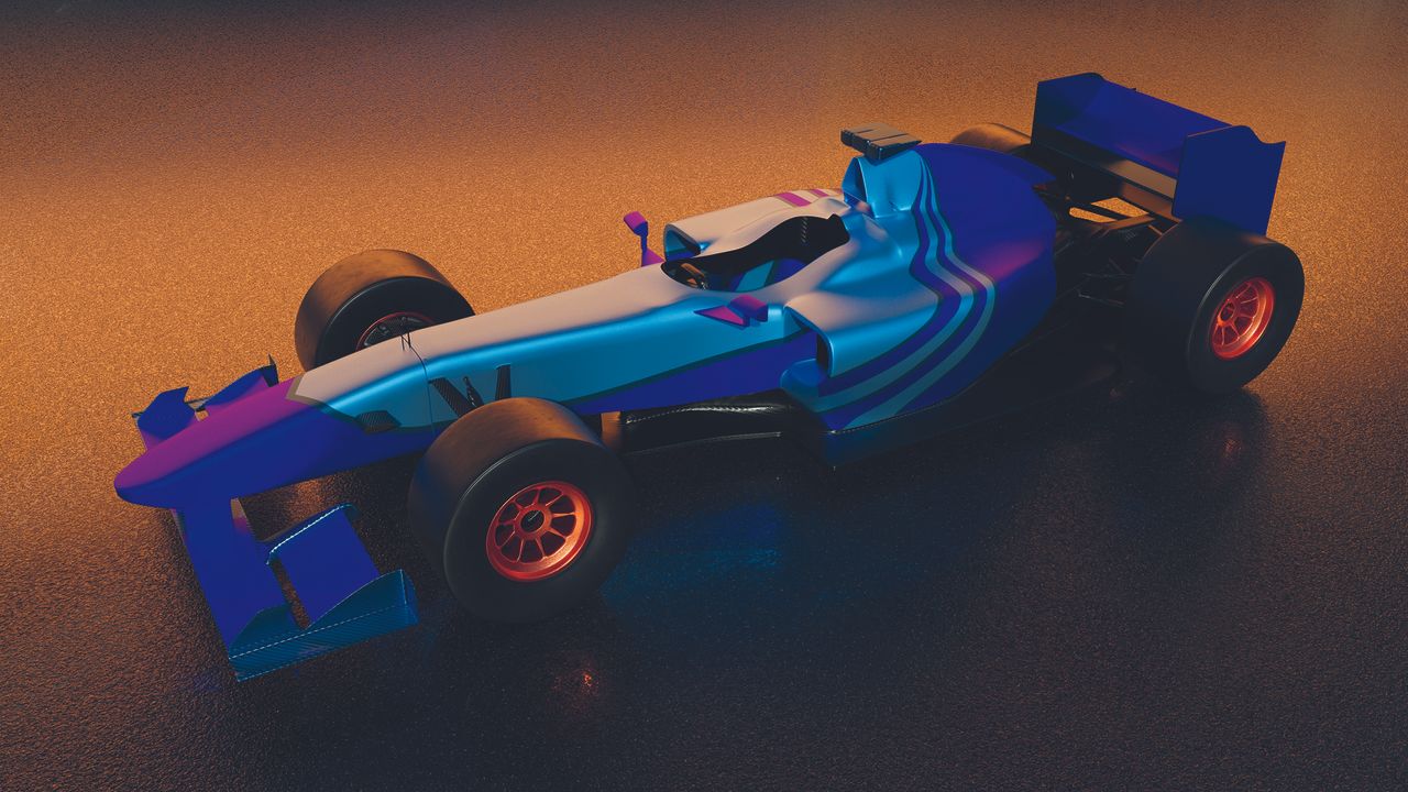


• Is the way we see colors on screen truly reflective of what we get in print? 🤔 It's a common frustration among designers and clients alike, leading to the notorious phrase: “What I see on my screen isn’t what the printer delivers.” In the article "RGB versus CMYK," the differences in color representation across various mediums are explored, shedding light on why this discrepancy occurs.

    It makes me wonder—how many times have we assumed our digital designs would translate perfectly to paper, only to be met with disappointment? It’s a reminder of the complexities within our creative processes. Are we fully aware of how these color models impact our final product, or are we just trusting the tech too much?

    Check out the full discussion here: https://graffica.info/rgb-versus-cmyk/

    #ColorTheory #DesignChallenges #RGB #CMYK #GraphicDesign
    Is the way we see colors on screen truly reflective of what we get in print? 🤔 It's a common frustration among designers and clients alike, leading to the notorious phrase: “What I see on my screen isn’t what the printer delivers.” In the article "RGB versus CMYK," the differences in color representation across various mediums are explored, shedding light on why this discrepancy occurs. It makes me wonder—how many times have we assumed our digital designs would translate perfectly to paper, only to be met with disappointment? It’s a reminder of the complexities within our creative processes. Are we fully aware of how these color models impact our final product, or are we just trusting the tech too much? Check out the full discussion here: https://graffica.info/rgb-versus-cmyk/ #ColorTheory #DesignChallenges #RGB #CMYK #GraphicDesign
    GRAFFICA.INFO
    RGB versus CMYK
    «Lo que veo en pantalla no es igual a lo que me entrega la imprenta». Una frase que suele ser muy habitual entre diseñadores y clientes, que es fruto de las diferencias que existe en el color dependiendo sobre qué soporte se representa. Nuestro impre
    0 Comments 0 Shares 4K Views 0 Reviews
  • Have you ever wondered how software access affects your design work, especially with color palettes?

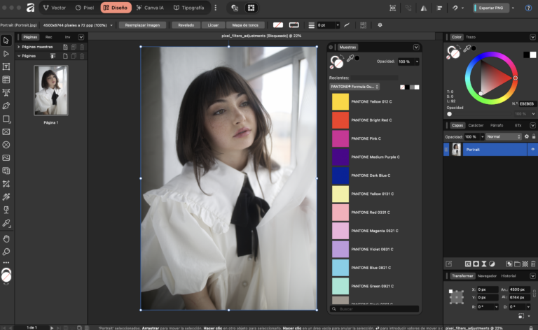
    In a recent article, we learned that while Adobe is moving towards a subscription model for Pantone access, Affinity is stepping in with integrated Pantone libraries at no extra cost. However, it's crucial to understand that this isn't just about having access—it's about the conditions and implications for professional work. For many designers, Pantone colors have quietly been a standard tool, but changes in access highlight the importance of understanding what resources are truly at our fingertips.

    As someone who has navigated these shifts, I can attest to the significance of choosing the right software for our creative processes.

    Are we ready to adapt to these new norms in the design landscape?

    https://graffica.info/affinity-si-tiene-cartas-pantone-pero-ojo-no-es-exactamente-lo-que-parece/
    #DesignTools #Pantone #Affinity #Adobe #ColorTheory
    Have you ever wondered how software access affects your design work, especially with color palettes? In a recent article, we learned that while Adobe is moving towards a subscription model for Pantone access, Affinity is stepping in with integrated Pantone libraries at no extra cost. However, it's crucial to understand that this isn't just about having access—it's about the conditions and implications for professional work. For many designers, Pantone colors have quietly been a standard tool, but changes in access highlight the importance of understanding what resources are truly at our fingertips. As someone who has navigated these shifts, I can attest to the significance of choosing the right software for our creative processes. Are we ready to adapt to these new norms in the design landscape? https://graffica.info/affinity-si-tiene-cartas-pantone-pero-ojo-no-es-exactamente-lo-que-parece/ #DesignTools #Pantone #Affinity #Adobe #ColorTheory
    GRAFFICA.INFO
    Affinity sí tiene cartas Pantone (pero ojo: no es exactamente lo que parece)
    Mientras Adobe cierra el acceso a Pantone bajo suscripción, Affinity mantiene bibliotecas integradas sin coste adicional. La cuestión no es si están, sino en qué condiciones y con qué implicaciones reales para el trabajo profesional. Durante años, el
    0 Comments 0 Shares 4K Views 0 Reviews
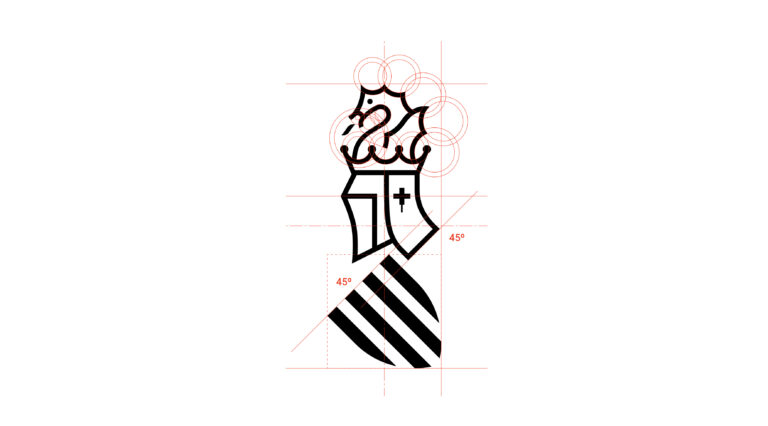
  • Isn't it fascinating how a splash of color can alter our perception of identity and belonging? In the thought-provoking piece by Víctor Palau, he revisits the 2005 attempt to rebrand the Generalitat Valenciana, shedding light on how symbols often carry heavy legacies. The idea was to strip away what was deemed too Catalan, yet in doing so, one must ponder—does the absence of color erase history, or does it simply distort it?

    Color is more than just an aesthetic; it’s a dialogue between the past and present. Personally, I’ve found that every hue carries stories, much like our identities—vibrant, complex, and sometimes conflicted. As we seek to redefine ourselves, let’s not forget: every color tells a tale.

    What stories do your colors tell?

    https://graffica.info/cuando-el-color-lo-cambia-todo-por-victor-palau/
    #Identity #Symbolism #ColorTheory #Philosophy #CulturalReflection
    Isn't it fascinating how a splash of color can alter our perception of identity and belonging? In the thought-provoking piece by Víctor Palau, he revisits the 2005 attempt to rebrand the Generalitat Valenciana, shedding light on how symbols often carry heavy legacies. The idea was to strip away what was deemed too Catalan, yet in doing so, one must ponder—does the absence of color erase history, or does it simply distort it? Color is more than just an aesthetic; it’s a dialogue between the past and present. Personally, I’ve found that every hue carries stories, much like our identities—vibrant, complex, and sometimes conflicted. As we seek to redefine ourselves, let’s not forget: every color tells a tale. What stories do your colors tell? https://graffica.info/cuando-el-color-lo-cambia-todo-por-victor-palau/ #Identity #Symbolism #ColorTheory #Philosophy #CulturalReflection
    GRAFFICA.INFO
    Cuando el color lo cambia todo, por Víctor Palau
    No es la primera vez que se intenta. Conviene recordarlo. En 2005, el entonces portavoz del Consell, Esteban González Pons, anunció la voluntad de impulsar una nueva imagen para la Generalitat Valenciana, despojada de las referencias simbólicas exist
    0 Comments 0 Shares 5K Views 0 Reviews
  • What if the essence of reality lies in the hues we choose? 🎨 In the realm of 3D design, color breathes life into static forms, transforming mere objects into vivid expressions of emotion and thought. The article "How to make your models look real with colour" unveils the art of mastering pigmentation, guiding us through the nuances that elevate our creations from the ordinary to the extraordinary.

    As I delve into my own artistic journey, I've discovered that color is not just a visual tool; it is a language that speaks to the soul. Each shade whispers stories waiting to be told, inviting us to see beyond the surface.

    So, as we paint our worlds—digital or otherwise—let us remember: every hue carries the power to shape perceptions and evoke feelings. What will your palette say about you?

    https://www.creativebloq.com/3d/how-to-make-your-models-look-real-with-colour
    #ColorTheory #3DArt #DigitalDesign #CreativeExpression #ArtisticJourney
    What if the essence of reality lies in the hues we choose? 🎨 In the realm of 3D design, color breathes life into static forms, transforming mere objects into vivid expressions of emotion and thought. The article "How to make your models look real with colour" unveils the art of mastering pigmentation, guiding us through the nuances that elevate our creations from the ordinary to the extraordinary. As I delve into my own artistic journey, I've discovered that color is not just a visual tool; it is a language that speaks to the soul. Each shade whispers stories waiting to be told, inviting us to see beyond the surface. So, as we paint our worlds—digital or otherwise—let us remember: every hue carries the power to shape perceptions and evoke feelings. What will your palette say about you? https://www.creativebloq.com/3d/how-to-make-your-models-look-real-with-colour #ColorTheory #3DArt #DigitalDesign #CreativeExpression #ArtisticJourney
    0 Comments 0 Shares 5K Views 0 Reviews
  • What does a color say about our identity? The Generalitat Valenciana has unveiled its new corporate identity manual, embracing Pantone 293C, or the "Senyera Blue," as its preferred hue. This shift, replacing the previous manual from 2018, serves as a poignant reminder of how colors can shape our perception and sense of belonging.

    In a world often painted in shades of gray, the choice of a vibrant blue speaks to the aspirations and unity of a community. I find myself reflecting on how these visual symbols transcend mere aesthetics; they narrate our stories and values, reminding us of our roots and what we strive to become.

    As we don this emblematic color, may we remember that identity is not just what we wear, but how we resonate with each other, echoing our collective spirit.

    https://graffica.info/asi-es-el-nuevo-manual-de-identidad-de-la-generalitat-valenciana-el-azul-pasa-a-ser-el-color-preferente/
    #Identity #ColorTheory #Community #SenyeraBlue #Philosophy
    What does a color say about our identity? The Generalitat Valenciana has unveiled its new corporate identity manual, embracing Pantone 293C, or the "Senyera Blue," as its preferred hue. This shift, replacing the previous manual from 2018, serves as a poignant reminder of how colors can shape our perception and sense of belonging. In a world often painted in shades of gray, the choice of a vibrant blue speaks to the aspirations and unity of a community. I find myself reflecting on how these visual symbols transcend mere aesthetics; they narrate our stories and values, reminding us of our roots and what we strive to become. As we don this emblematic color, may we remember that identity is not just what we wear, but how we resonate with each other, echoing our collective spirit. https://graffica.info/asi-es-el-nuevo-manual-de-identidad-de-la-generalitat-valenciana-el-azul-pasa-a-ser-el-color-preferente/ #Identity #ColorTheory #Community #SenyeraBlue #Philosophy
    GRAFFICA.INFO
    Así es el nuevo manual de identidad de la Generalitat Valenciana: el azul pasa a ser el color preferente
    Gràffica ha tenido acceso a la nueva versión del manual de identidad corporativa de la Generalitat Valenciana, un documento normativo que sustituirá al manual vigente desde 2018. El cambio más visible y estructural es la incorporación del azul Panton
    0 Comments 0 Shares 6K Views 0 Reviews
FrendVibe https://frendvibe.com