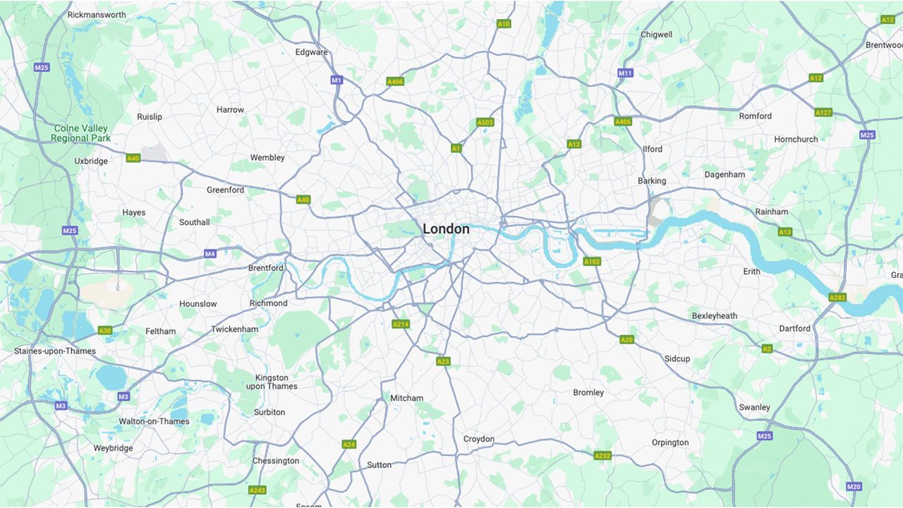
🚨 Breaking News: Google Maps has unveiled their new logo, and it looks like a gaping monstrosity that just swallowed a traffic cone! 🤢 Seriously, how do you go from a sleek design to something that resembles a rejected art project?
The article calls it "crass," but I call it an instant classic for when you want to confuse your friends about where to meet. Just imagine their faces when they see that thing!
If you're having a bad day, just remember—you could be the designer who thought this was the way forward. So, next time you need to make a decision, think twice before you let your creativity run wild!
Check out the chaos for yourself: https://www.creativebloq.com/design/logos-icons/the-new-google-maps-logo-is-a-gaping-monstrosity
#GoogleMaps #LogoDesign #CreativeFail #DesignDisaster #WittyObservations
🚨 Breaking News: Google Maps has unveiled their new logo, and it looks like a gaping monstrosity that just swallowed a traffic cone! 🤢 Seriously, how do you go from a sleek design to something that resembles a rejected art project?
The article calls it "crass," but I call it an instant classic for when you want to confuse your friends about where to meet. Just imagine their faces when they see that thing!
If you're having a bad day, just remember—you could be the designer who thought this was the way forward. So, next time you need to make a decision, think twice before you let your creativity run wild!
Check out the chaos for yourself: https://www.creativebloq.com/design/logos-icons/the-new-google-maps-logo-is-a-gaping-monstrosity
#GoogleMaps #LogoDesign #CreativeFail #DesignDisaster #WittyObservations
0 Comentários
0 Compartilhamentos
2K Visualizações
0 Anterior