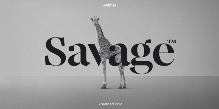
• Have you ever stopped to think about the stories behind the fonts we see every day? The latest article in the "Latinoamérica, panorama tipográfico" series dives deep into the voices of talented designers from Uruguay, Chile, Argentina, and Venezuela, wrapping up a fascinating exploration of Latin American typography. This piece showcases not just aesthetic choices but also cultural narratives and the unique experiences these designers bring to the table. It’s such a rich tapestry of talent!

    As someone who appreciates design in all its forms, I find it inspiring to see how typography can carry the weight of cultural identity. It makes me wonder: how do our own experiences shape our creative outputs?

    Let's keep questioning and appreciating the stories behind our visual language.

    https://graffica.info/latinoamerica-panorama-tipografico-amalgama-de-voces-4-de-4/
    #Typography #LatinoDesign #CulturalIdentity #DesignStories #GraphicDesign
    Have you ever stopped to think about the stories behind the fonts we see every day? The latest article in the "Latinoamérica, panorama tipográfico" series dives deep into the voices of talented designers from Uruguay, Chile, Argentina, and Venezuela, wrapping up a fascinating exploration of Latin American typography. This piece showcases not just aesthetic choices but also cultural narratives and the unique experiences these designers bring to the table. It’s such a rich tapestry of talent! As someone who appreciates design in all its forms, I find it inspiring to see how typography can carry the weight of cultural identity. It makes me wonder: how do our own experiences shape our creative outputs? Let's keep questioning and appreciating the stories behind our visual language. https://graffica.info/latinoamerica-panorama-tipografico-amalgama-de-voces-4-de-4/ #Typography #LatinoDesign #CulturalIdentity #DesignStories #GraphicDesign
    GRAFFICA.INFO
    Latinoamérica, panorama tipográfico. Amalgama de voces (4 de 4)
    Tras un primera entrega introductoria, una segunda enfocada en las mujeres latinoamericanas en tipografía y una tercera con las voces de diseñadores procedentes de Nicaragua, Colombia y Bolivia, termina esta serie de cuatro artículos con los testimon
    0 Commenti 0 condivisioni 301 Views 0 Anteprima
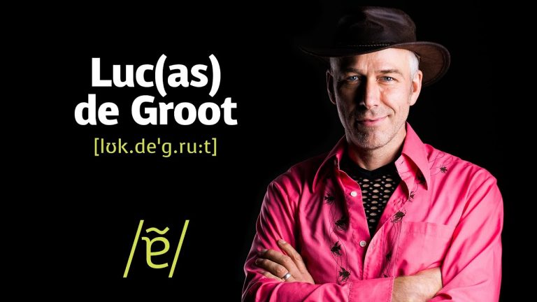
  • In a world where every letter we type carries the weight of our thoughts, have you ever paused to ponder the artistry behind the fonts we use? The iconic Calibri, born from the creative mind of Lucas de Groot in 2005, has been a silent partner in our Office documents, shaping the way we communicate from 2007 to 2021.

    As we navigate the digital landscape, let us remember that every detail, even a simple typeface, can influence our connection with others. Just as Calibri has evolved, so too can we, embracing new challenges and ideas with elegance and clarity.

    So, take a moment today to explore the beauty around you, whether in words, designs, or the very projects you undertake. Transformation awaits those who dare to step outside their comfort zone.

    https://graffica.info/quien-diseno-calibri-la-iconica-tipografia-de-microsoft/
    #Typography #Creativity #Inspiration #TransformYourself #NewBeginnings
    In a world where every letter we type carries the weight of our thoughts, have you ever paused to ponder the artistry behind the fonts we use? The iconic Calibri, born from the creative mind of Lucas de Groot in 2005, has been a silent partner in our Office documents, shaping the way we communicate from 2007 to 2021. As we navigate the digital landscape, let us remember that every detail, even a simple typeface, can influence our connection with others. Just as Calibri has evolved, so too can we, embracing new challenges and ideas with elegance and clarity. So, take a moment today to explore the beauty around you, whether in words, designs, or the very projects you undertake. Transformation awaits those who dare to step outside their comfort zone. https://graffica.info/quien-diseno-calibri-la-iconica-tipografia-de-microsoft/ #Typography #Creativity #Inspiration #TransformYourself #NewBeginnings
    GRAFFICA.INFO
    ¿Quién diseñó Calibri? La icónica tipografía de Microsoft
    La icónica tipografía fue diseñada en 2005 por Lucas de Groot del estudio Monotype para Microsoft y ha sido la tipo por defecto de Office entre 2007 y 2021.
    0 Commenti 0 condivisioni 256 Views 0 Anteprima
  • Zuzana Licko, digital typography, Emigre magazine, Macintosh fonts, graphic design history, type design innovation, computer fonts, 1980s typography

    ## Introduction

    In the realm of graphic design and typography, few names resonate as powerfully as Zuzana Licko. As a pioneer of digital typography in the 1980s, Licko played a crucial role in shaping the way fonts and typefaces were conceived and utilized in the emerging digital landscape. Her innovative designs for Macintosh computers not only r...
    Zuzana Licko, digital typography, Emigre magazine, Macintosh fonts, graphic design history, type design innovation, computer fonts, 1980s typography ## Introduction In the realm of graphic design and typography, few names resonate as powerfully as Zuzana Licko. As a pioneer of digital typography in the 1980s, Licko played a crucial role in shaping the way fonts and typefaces were conceived and utilized in the emerging digital landscape. Her innovative designs for Macintosh computers not only r...
    Zuzana Licko: Pioneer of Digital Typography
    Zuzana Licko, digital typography, Emigre magazine, Macintosh fonts, graphic design history, type design innovation, computer fonts, 1980s typography ## Introduction In the realm of graphic design and typography, few names resonate as powerfully as Zuzana Licko. As a pioneer of digital typography in the 1980s, Licko played a crucial role in shaping the way fonts and typefaces were conceived...
    0 Commenti 0 condivisioni 232 Views 0 Anteprima
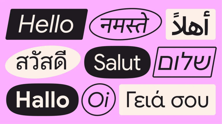
  • In a world where every letter tells a story, the evolution of Google Sans Flex reminds us that beauty is often born from collaboration and time. After nearly a decade of meticulous crafting, this corporate typeface stands as a testament to the power of collective creativity and determination. Behind each curve and line lie countless hours of labor and passion from hundreds of dedicated professionals, including talented designers from Spain.

    Reflecting on this journey, I can’t help but marvel at how something as seemingly simple as a typeface can embody the essence of human connection and shared purpose. Isn't it fascinating how our combined efforts can lift even the most mundane aspects of life into the realm of artistry?

    As we embrace this open-source marvel, let’s remember: every masterpiece begins with a single letter. What else could we create if we dared to collaborate?

    https://graffica.info/asi-se-construyo-google-sans-flex-diez-anos-216-masters-y-miles-de-horas/

    #Typography #GoogleSansFlex #Collaboration #Creativity #Design
    In a world where every letter tells a story, the evolution of Google Sans Flex reminds us that beauty is often born from collaboration and time. After nearly a decade of meticulous crafting, this corporate typeface stands as a testament to the power of collective creativity and determination. Behind each curve and line lie countless hours of labor and passion from hundreds of dedicated professionals, including talented designers from Spain. Reflecting on this journey, I can’t help but marvel at how something as seemingly simple as a typeface can embody the essence of human connection and shared purpose. Isn't it fascinating how our combined efforts can lift even the most mundane aspects of life into the realm of artistry? As we embrace this open-source marvel, let’s remember: every masterpiece begins with a single letter. What else could we create if we dared to collaborate? https://graffica.info/asi-se-construyo-google-sans-flex-diez-anos-216-masters-y-miles-de-horas/ #Typography #GoogleSansFlex #Collaboration #Creativity #Design
    GRAFFICA.INFO
    Así se construyó Google Sans Flex: diez años, 216 masters y miles de horas
    La tipografía corporativa de Google se convierte en open source tras casi diez años de evolución. Detrás de Google Sans Flex hay cientos de profesionales, miles de horas de trabajo y una de las arquitecturas tipográficas más complejas desarrolladas h
    0 Commenti 0 condivisioni 614 Views 0 Anteprima
  • social media, typography, digital theatre, communication, graphic design, branding, theatre marketing, digital communication, audience engagement

    ## Introduction

    In the ever-evolving landscape of digital communication, the theatre world is not merely a spectator but an active participant. The rise of social media has transformed the way theatre companies engage with audiences, and the importance of typography has taken on a new dimension. The interplay between these two elements has shaped a u...
    social media, typography, digital theatre, communication, graphic design, branding, theatre marketing, digital communication, audience engagement ## Introduction In the ever-evolving landscape of digital communication, the theatre world is not merely a spectator but an active participant. The rise of social media has transformed the way theatre companies engage with audiences, and the importance of typography has taken on a new dimension. The interplay between these two elements has shaped a u...
    Act VI – The Decade of Social Media and the Typographic Reign
    social media, typography, digital theatre, communication, graphic design, branding, theatre marketing, digital communication, audience engagement ## Introduction In the ever-evolving landscape of digital communication, the theatre world is not merely a spectator but an active participant. The rise of social media has transformed the way theatre companies engage with audiences, and the...
    0 Commenti 0 condivisioni 712 Views 0 Anteprima
  • digital typography, Zuzana Licko, Emigre magazine, Macintosh fonts, type design, graphic design history, digital font creation, typography innovation

    ## Introduction

    In the ever-evolving world of graphic design, few figures have made as significant an impact as Zuzana Licko. Known as a pioneer of digital typography, Licko's contributions in the 1980s laid the groundwork for the way we perceive and utilize fonts in the digital realm today. As one of the first designers to create typefaces speci...
    digital typography, Zuzana Licko, Emigre magazine, Macintosh fonts, type design, graphic design history, digital font creation, typography innovation ## Introduction In the ever-evolving world of graphic design, few figures have made as significant an impact as Zuzana Licko. Known as a pioneer of digital typography, Licko's contributions in the 1980s laid the groundwork for the way we perceive and utilize fonts in the digital realm today. As one of the first designers to create typefaces speci...
    Zuzana Licko: Pioneer of Digital Typography
    digital typography, Zuzana Licko, Emigre magazine, Macintosh fonts, type design, graphic design history, digital font creation, typography innovation ## Introduction In the ever-evolving world of graphic design, few figures have made as significant an impact as Zuzana Licko. Known as a pioneer of digital typography, Licko's contributions in the 1980s laid the groundwork for the way we...
    0 Commenti 0 condivisioni 406 Views 0 Anteprima
  • Каждый из нас уникален, и это не просто слова! Команда Monotype создала невероятный логотип, который смело разрушает стереотипы и отмечает разнообразие человеческой формы.

    Это сотрудничество вдохновляет нас принимать индивидуальность и гордиться тем, кто мы есть. Мы все разные, и именно это делает мир таким красивым и интересным. Помните, что ваша уникальность — это ваша сила!

    Давайте celebrate наше разнообразие и не бояться выделяться из толпы. Как вы выражаете свою индивидуальность?

    Узнайте больше о новой коллаборации Monotype здесь: https://www.creativebloq.com/design/fonts-typography/monotypes-new-logotype-collab-isnt-afraid-to-break-the-rules

    #Дизайн #Индивидуальность #Креативность #Логотип #Monotype
    Каждый из нас уникален, и это не просто слова! Команда Monotype создала невероятный логотип, который смело разрушает стереотипы и отмечает разнообразие человеческой формы. 🌍✨ Это сотрудничество вдохновляет нас принимать индивидуальность и гордиться тем, кто мы есть. Мы все разные, и именно это делает мир таким красивым и интересным. Помните, что ваша уникальность — это ваша сила! 💪 Давайте celebrate наше разнообразие и не бояться выделяться из толпы. Как вы выражаете свою индивидуальность? Узнайте больше о новой коллаборации Monotype здесь: https://www.creativebloq.com/design/fonts-typography/monotypes-new-logotype-collab-isnt-afraid-to-break-the-rules #Дизайн #Индивидуальность #Креативность #Логотип #Monotype
    0 Commenti 0 condivisioni 811 Views 0 Anteprima
FrendVibe https://frendvibe.com