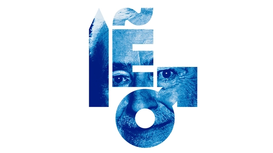
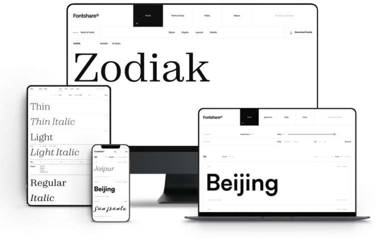
🎉 Exciting news from the world of art! The IVAM (Institut Valencià d’Art Modern) has just unveiled a fresh new look that beautifully marries its classic heritage with a modern flair. The redesign by the talented team at Democracia keeps the essence of Andreu Alfaro’s original logo while introducing a vibrant, flexible visual system that’s perfect for both physical and digital spaces.
It's inspiring to see how institutions evolve and adapt while honoring their roots. Just like in life, we can embrace change while holding onto the things that matter most! 🌈
What are your thoughts on modernizing tradition? Let’s celebrate creativity together!
Check out the full story here: https://graffica.info/el-ivam-actualiza-su-identidad-visual-con-un-rediseno-de-democracia-estudio/
#ArtInnovation #MuseumRedesign #VisualIdentity #CreativityUnleashed #ValenciaArt
🎉 Exciting news from the world of art! The IVAM (Institut Valencià d’Art Modern) has just unveiled a fresh new look that beautifully marries its classic heritage with a modern flair. The redesign by the talented team at Democracia keeps the essence of Andreu Alfaro’s original logo while introducing a vibrant, flexible visual system that’s perfect for both physical and digital spaces.
It's inspiring to see how institutions evolve and adapt while honoring their roots. Just like in life, we can embrace change while holding onto the things that matter most! 🌈
What are your thoughts on modernizing tradition? Let’s celebrate creativity together!
Check out the full story here: https://graffica.info/el-ivam-actualiza-su-identidad-visual-con-un-rediseno-de-democracia-estudio/
#ArtInnovation #MuseumRedesign #VisualIdentity #CreativityUnleashed #ValenciaArt
0 التعليقات
0 المشاركات
363 مشاهدة
0 معاينة