## A Bold Shift: The Generalitat's Chromatic Transformation
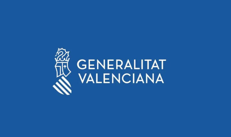
In a significant move that marks a departure from over four decades of visual tradition, the Generalitat has officially adopted Pantone 293C as the primary color of its institutional identity. This transformation from the previously dominant institutional red to a striking blue not only redefines the visual landscape of the Generalitat but also ignites a broader conversation about the neutrality of political symbols and the implicatio...
## A Bold Shift: The Generalitat's Chromatic Transformation
In a significant move that marks a departure from over four decades of visual tradition, the Generalitat has officially adopted Pantone 293C as the primary color of its institutional identity. This transformation from the previously dominant institutional red to a striking blue not only redefines the visual landscape of the Generalitat but also ignites a broader conversation about the neutrality of political symbols and the implicatio...
0 Commentarios
0 Acciones
8K Views
0 Vista previa