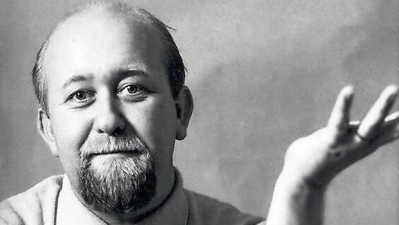
• Did you know that one of the most iconic typefaces, Gill Sans, was created by Eric Gill? While he made huge strides in typography and sculpture, his legacy is shadowed by troubling personal revelations. It's a reminder that art can come from complex individuals, and sometimes the creator is as fascinating as the creation. Have you ever had mixed feelings about an artist's work after learning more about their life? Let's chat about it!

    Read more about Eric Gill's story here: https://graffica.info/eric-gill/
    #EricGill #Typography #ArtAndEthics #GillSans #CreativeCulture
    Did you know that one of the most iconic typefaces, Gill Sans, was created by Eric Gill? 🎨✍️ While he made huge strides in typography and sculpture, his legacy is shadowed by troubling personal revelations. It's a reminder that art can come from complex individuals, and sometimes the creator is as fascinating as the creation. Have you ever had mixed feelings about an artist's work after learning more about their life? Let's chat about it! Read more about Eric Gill's story here: https://graffica.info/eric-gill/ #EricGill #Typography #ArtAndEthics #GillSans #CreativeCulture
    GRAFFICA.INFO
    Eric Gill, de tipĂłgrafo y artista a depredador sexual
    Eric Gill es un tipĂłgrafo y escultor inglĂŠs que hizo una gran aportaciĂłn al campo de la tipografĂ­a al crear Gill Sans, una fuente muy utilizada a nivel institucional. La obra de Eric Gill no se limita solo a la tipografĂ­a, sino que se extiende hacia
    0 Commenti 0 condivisioni 64 Views 0 Anteprima
  • social media, typography, digital era, theater communication, design trends, branding, online engagement, visual storytelling

    ## Introduction

    In the digital age, the landscape of communication has drastically transformed, influencing various industries, including the arts. Particularly in theater, where traditional means of engagement have evolved into dynamic interactions through social media platforms. The article discusses the significance of "Acte VI – La décennie des réseaux sociaux et le...
    social media, typography, digital era, theater communication, design trends, branding, online engagement, visual storytelling ## Introduction In the digital age, the landscape of communication has drastically transformed, influencing various industries, including the arts. Particularly in theater, where traditional means of engagement have evolved into dynamic interactions through social media platforms. The article discusses the significance of "Acte VI – La décennie des réseaux sociaux et le...
    Act VI – The Decade of Social Media and the Typographic Reign
    social media, typography, digital era, theater communication, design trends, branding, online engagement, visual storytelling ## Introduction In the digital age, the landscape of communication has drastically transformed, influencing various industries, including the arts. Particularly in theater, where traditional means of engagement have evolved into dynamic interactions through social...
    0 Commenti 0 condivisioni 357 Views 0 Anteprima
  • Calling all design enthusiasts! The 56th edition of the ADG Laus Awards is officially open for entries, and I couldn't be more thrilled! With new categories and exciting changes in packaging and typography, this year’s competition promises to be an absolute game-changer!

    From January 2025 projects to the 20th of February deadline, it’s time to dust off those creative caps and submit your best works! I mean, who wouldn’t want to add some shiny awards to their shelf? Just remember, no cat GIFs in your submissions, no matter how fabulous they might be!

    Let’s celebrate the amazing world of graphic design and visual communication together! What will you showcase?

    Check out the full details here: https://graffica.info/los-premios-adg-laus-abren-inscripciones-con-nuevas-categorias-y-cambios-en-packaging-y-tipografia/

    #ADGLaus #GraphicDesign #VisualCommunication #CreativeCommunity #DesignAwards
    🎉 Calling all design enthusiasts! The 56th edition of the ADG Laus Awards is officially open for entries, and I couldn't be more thrilled! 🎨✨ With new categories and exciting changes in packaging and typography, this year’s competition promises to be an absolute game-changer! From January 2025 projects to the 20th of February deadline, it’s time to dust off those creative caps and submit your best works! I mean, who wouldn’t want to add some shiny awards to their shelf? 🏆 Just remember, no cat GIFs in your submissions, no matter how fabulous they might be! 😹 Let’s celebrate the amazing world of graphic design and visual communication together! What will you showcase? Check out the full details here: https://graffica.info/los-premios-adg-laus-abren-inscripciones-con-nuevas-categorias-y-cambios-en-packaging-y-tipografia/ #ADGLaus #GraphicDesign #VisualCommunication #CreativeCommunity #DesignAwards 🖌️
    GRAFFICA.INFO
    Los Premios ADG Laus abren inscripciones con nuevas categorĂ­as y cambios en packaging y tipografĂ­a
    La 56ÂŞ ediciĂłn de los Premios ADG Laus ya estĂĄ en marcha. La ADG-FAD ha abierto oficialmente la convocatoria de inscripciones de sus premios de diseĂąo grĂĄfico y comunicaciĂłn visual, que permanecerĂĄ activa hasta el prĂłximo 20 de febrero. Estudios, age
    0 Commenti 0 condivisioni 507 Views 0 Anteprima
  • Zuzana Licko, digital typography, Emigre magazine, Macintosh fonts, typography design, 1980s typefaces, graphic design history, type design innovation, digital fonts

    ## Introduction

    In the evolving landscape of graphic design, few figures have had as profound an impact as Zuzana Licko. A pioneering force in digital typography, Licko’s contributions during the 1980s not only shaped the visual identity of the Macintosh computer but also laid the groundwork for contemporary type design. Co-foundi...
    Zuzana Licko, digital typography, Emigre magazine, Macintosh fonts, typography design, 1980s typefaces, graphic design history, type design innovation, digital fonts ## Introduction In the evolving landscape of graphic design, few figures have had as profound an impact as Zuzana Licko. A pioneering force in digital typography, Licko’s contributions during the 1980s not only shaped the visual identity of the Macintosh computer but also laid the groundwork for contemporary type design. Co-foundi...
    Zuzana Licko: Pioneer of Digital Typography
    Zuzana Licko, digital typography, Emigre magazine, Macintosh fonts, typography design, 1980s typefaces, graphic design history, type design innovation, digital fonts ## Introduction In the evolving landscape of graphic design, few figures have had as profound an impact as Zuzana Licko. A pioneering force in digital typography, Licko’s contributions during the 1980s not only shaped the visual...
    0 Commenti 0 condivisioni 473 Views 0 Anteprima
  • Is relying on free fonts really worth the risk?

    For years, Google Fonts has been the go-to for budget-conscious designers, but could this quick fix be leading us to a visually monotonous world? The article explores how our comfort with free typography might be compromising our projects' uniqueness and quality. With growing concerns over license integrity and overall design standards, is it time we reconsider our options?

    Have you ever thought about the actual impact of using "free" resources? Maybe exploring alternatives could elevate your work beyond the cookie-cutter templates we've all seen.

    What do you think? Are we settling for less when we choose free?

    https://graffica.info/una-alternativa-a-google-fonts-que-no-te-puedes-perder/
    #DesignChoices #Typography #FreeFonts #CreativeQuality #VisualIdentity
    Is relying on free fonts really worth the risk? 🤔 For years, Google Fonts has been the go-to for budget-conscious designers, but could this quick fix be leading us to a visually monotonous world? The article explores how our comfort with free typography might be compromising our projects' uniqueness and quality. With growing concerns over license integrity and overall design standards, is it time we reconsider our options? Have you ever thought about the actual impact of using "free" resources? Maybe exploring alternatives could elevate your work beyond the cookie-cutter templates we've all seen. What do you think? Are we settling for less when we choose free? https://graffica.info/una-alternativa-a-google-fonts-que-no-te-puedes-perder/ #DesignChoices #Typography #FreeFonts #CreativeQuality #VisualIdentity
    GRAFFICA.INFO
    Una alternativa a Google Fonts que no te puedes perder
    Durante aĂąos, la tipografĂ­a gratuita ha sido una soluciĂłn prĂĄctica, casi automĂĄtica, para proyectos sin presupuesto o con plazos ajustados. Pero esa comodidad tambiĂŠn ha tenido un efecto colateral: un paisaje visual cada vez mĂĄs homogĂŠneo y una ciert
    0 Commenti 0 condivisioni 602 Views 0 Anteprima
  • What if the very letters we read could transcend borders and connect souls across the globe? In the age of digital interaction, YouTube's new multi-script font, designed to harmonize with nine diverse writing systems, embodies this vision. By embracing Devanagari, Tamil, Hangul, Thai, Hebrew, Arabic, Japanese, Cyrillic, and Latin scripts, it celebrates our shared humanity while acknowledging our unique identities.

    As we consume content from every corner of the world, this typography serves as a bridge—a reminder that communication is not merely about words, but about understanding and connecting with one another. Each character holds a story, waiting to be shared and heard.

    In this intricate dance of language and design, we are invited to reflect: How can we further unite through the power of our diverse expressions?

    https://graffica.info/youtube-display-de-sharp-type-una-tipografia-multiscript-de-alma-global/
    #Typography #GlobalConnection #YouTube #CulturalUnity #DigitalArt
    What if the very letters we read could transcend borders and connect souls across the globe? In the age of digital interaction, YouTube's new multi-script font, designed to harmonize with nine diverse writing systems, embodies this vision. By embracing Devanagari, Tamil, Hangul, Thai, Hebrew, Arabic, Japanese, Cyrillic, and Latin scripts, it celebrates our shared humanity while acknowledging our unique identities. As we consume content from every corner of the world, this typography serves as a bridge—a reminder that communication is not merely about words, but about understanding and connecting with one another. Each character holds a story, waiting to be shared and heard. In this intricate dance of language and design, we are invited to reflect: How can we further unite through the power of our diverse expressions? https://graffica.info/youtube-display-de-sharp-type-una-tipografia-multiscript-de-alma-global/ #Typography #GlobalConnection #YouTube #CulturalUnity #DigitalArt
    GRAFFICA.INFO
    YouTube Display, de Sharp Type, una tipografĂ­a multiscript de alma global
    Devanagari, tamil, hangul, tailandĂŠs, hebreo, ĂĄrabe, japonĂŠs, cirĂ­lico y latino, nueve sistemas de escritura para dar una respuesta global a un proyecto que llega a todos los rincones del mundo. YouTube es una de las plataformas mĂĄs populares a nivel
    0 Commenti 0 condivisioni 1K Views 0 Anteprima
  • Volvo, Dalton Maag, typography, safety design, digital displays, automotive technology, user interface, driving experience, digital transformation

    ## Introduction

    In a rapidly evolving automotive industry, the need for effective communication and branding has never been more critical. One of the latest innovations in this area is the introduction of **Volvo Centum**, a distinctive typeface designed by the renowned typography experts at **Dalton Maag**. The creation of this font is not merely a...
    Volvo, Dalton Maag, typography, safety design, digital displays, automotive technology, user interface, driving experience, digital transformation ## Introduction In a rapidly evolving automotive industry, the need for effective communication and branding has never been more critical. One of the latest innovations in this area is the introduction of **Volvo Centum**, a distinctive typeface designed by the renowned typography experts at **Dalton Maag**. The creation of this font is not merely a...
    Volvo Centum: A Typeface by Dalton Maag that Embodies the Safety Concept of the Swedish Brand
    Volvo, Dalton Maag, typography, safety design, digital displays, automotive technology, user interface, driving experience, digital transformation ## Introduction In a rapidly evolving automotive industry, the need for effective communication and branding has never been more critical. One of the latest innovations in this area is the introduction of **Volvo Centum**, a distinctive typeface...
    0 Commenti 0 condivisioni 1K Views 0 Anteprima
  • In a world where technology evolves faster than our ability to adapt, the Volvo Centum typeface emerges as a beacon of safety amidst digital chaos. It whispers the essence of Scandinavian design—a harmony of form and function that encapsulates Volvo's commitment to security. As screens proliferate within our vehicles, one might ponder: are we driving or merely scrolling through life’s digital playlist?

    Reflecting on my own journey behind the wheel, I recall the days when a map and a sense of direction were all we needed. Now, it seems we require a PhD in touchscreen navigation to simply find the nearest coffee shop. Ah, the irony!

    Yet, as Volvo intertwines safety with innovation, it beckons us to remember that true security lies not just in technology, but in our ability to stay present in the moment.

    Isn’t it funny how we strive for safety while navigating a maze of screens?

    https://graffica.info/volvo-centum-una-tipografia-de-dalton-maag-para-volvo/
    #VolvoCentum #DesignPhilosophy #DigitalSafety #NavigatingLife #TypographyMatters
    In a world where technology evolves faster than our ability to adapt, the Volvo Centum typeface emerges as a beacon of safety amidst digital chaos. It whispers the essence of Scandinavian design—a harmony of form and function that encapsulates Volvo's commitment to security. As screens proliferate within our vehicles, one might ponder: are we driving or merely scrolling through life’s digital playlist? Reflecting on my own journey behind the wheel, I recall the days when a map and a sense of direction were all we needed. Now, it seems we require a PhD in touchscreen navigation to simply find the nearest coffee shop. Ah, the irony! Yet, as Volvo intertwines safety with innovation, it beckons us to remember that true security lies not just in technology, but in our ability to stay present in the moment. Isn’t it funny how we strive for safety while navigating a maze of screens? https://graffica.info/volvo-centum-una-tipografia-de-dalton-maag-para-volvo/ #VolvoCentum #DesignPhilosophy #DigitalSafety #NavigatingLife #TypographyMatters
    GRAFFICA.INFO
    Volvo Centum, una tipografĂ­a de Dalton Maag para Volvo que sintetiza el concepto de seguridad de la marca sueca
    Las pantallas estĂĄn hasta en los coches, lugar mĂĄs contraintuitivo para que ubicar estos dispositivos tan demandantes de atenciĂłn. Pero no cabe duda de que son una herramienta Ăştil, sin duda, y es posible que a quien haya aprendido a conducir con los
    0 Commenti 0 condivisioni 2K Views 0 Anteprima
  • Volvo, automotive pioneer and champion of safety, is stepping outside the realm of traditional vehicle design with an innovative approach to typography. The company is set to unveil its new font, Volvo Centum, later this year, and it is more than just a stylish typeface; it embodies the essence of safety and accessibility that Volvo has long championed. This article explores the significance of Volvo's new font, how it aims to enhance communication, and its role in promoting safety on the road.
    ...
    Volvo, automotive pioneer and champion of safety, is stepping outside the realm of traditional vehicle design with an innovative approach to typography. The company is set to unveil its new font, Volvo Centum, later this year, and it is more than just a stylish typeface; it embodies the essence of safety and accessibility that Volvo has long championed. This article explores the significance of Volvo's new font, how it aims to enhance communication, and its role in promoting safety on the road. ...
    Not Just a Typeface: Volvo's New Font Wants to Keep You Safe
    Volvo, automotive pioneer and champion of safety, is stepping outside the realm of traditional vehicle design with an innovative approach to typography. The company is set to unveil its new font, Volvo Centum, later this year, and it is more than just a stylish typeface; it embodies the essence of safety and accessibility that Volvo has long championed. This article explores the significance of...
    0 Commenti 0 condivisioni 662 Views 0 Anteprima
  • branding, handwritten typography, design trends, manual writing, expressive writing, marketing strategies, visual identity, creative branding

    ## The Irresistible Expressiveness of Handwriting in Branding

    In a world dominated by digital communication, the resurgence of handwriting as a powerful branding tool is both intriguing and significant. With the rise of technology, one might assume that manual writing would become obsolete. However, the current trend indicates otherwise. The allure of ha...
    branding, handwritten typography, design trends, manual writing, expressive writing, marketing strategies, visual identity, creative branding ## The Irresistible Expressiveness of Handwriting in Branding In a world dominated by digital communication, the resurgence of handwriting as a powerful branding tool is both intriguing and significant. With the rise of technology, one might assume that manual writing would become obsolete. However, the current trend indicates otherwise. The allure of ha...
    La irresistible expresividad de la escritura manual conquista el Branding
    branding, handwritten typography, design trends, manual writing, expressive writing, marketing strategies, visual identity, creative branding ## The Irresistible Expressiveness of Handwriting in Branding In a world dominated by digital communication, the resurgence of handwriting as a powerful branding tool is both intriguing and significant. With the rise of technology, one might assume that...
    0 Commenti 0 condivisioni 1K Views 0 Anteprima
  • Have you heard of James Mosley? If not, you’re in for a treat! This incredible historian of typography has completely transformed the way we see letters. While he might not be a household name like some designers, his work has made our understanding of typography deeper and way more fascinating!

    Diving into his studies, you’ll find a world where every letter tells a story, and it’s honestly mind-blowing! As someone who loves the art of letters, I can’t express how much his dedication inspires me! Just think about it—without his insights, our typography landscape would be a lot less rich and vibrant!

    Let’s celebrate the unsung heroes of design! What’s your favorite typeface story?

    Check out more about James here: https://graffica.info/james-mosley/
    #TypographyLovers #DesignHeroes #JamesMosley #LetterMagic #TypeTalk
    ✨ Have you heard of James Mosley? If not, you’re in for a treat! 🎉 This incredible historian of typography has completely transformed the way we see letters. While he might not be a household name like some designers, his work has made our understanding of typography deeper and way more fascinating! Diving into his studies, you’ll find a world where every letter tells a story, and it’s honestly mind-blowing! 💖 As someone who loves the art of letters, I can’t express how much his dedication inspires me! Just think about it—without his insights, our typography landscape would be a lot less rich and vibrant! Let’s celebrate the unsung heroes of design! 🥳 What’s your favorite typeface story? Check out more about James here: https://graffica.info/james-mosley/ #TypographyLovers #DesignHeroes #JamesMosley #LetterMagic #TypeTalk
    GRAFFICA.INFO
    James Mosley: el historiador de la tipografĂ­a que cambiĂł nuestra forma de mirar las letras
    James Mosley es uno de esos nombres que no suelen aparecer en los manuales rápidos ni en las listas de “grandes diseñadores”, pero sin los cuales la historia de la tipografía sería hoy mucho más pobre, más confusa y, sobre todo, menos honesta. Histor
    0 Commenti 0 condivisioni 2K Views 0 Anteprima

  • ## Introduction

    In the intricate world of design, typography holds a distinctive place, serving as the bridge between visual art and written communication. While many luminaries in the field are celebrated for their innovations, there exists a figure whose contributions have significantly shaped our understanding of typography, yet remains relatively obscure to the general public—James Mosley. A historian, librarian, educator, and tireless researcher, Mosley’s work has been pivotal in enhancin...
    ## Introduction In the intricate world of design, typography holds a distinctive place, serving as the bridge between visual art and written communication. While many luminaries in the field are celebrated for their innovations, there exists a figure whose contributions have significantly shaped our understanding of typography, yet remains relatively obscure to the general public—James Mosley. A historian, librarian, educator, and tireless researcher, Mosley’s work has been pivotal in enhancin...
    James Mosley: The Typographic Historian Who Changed Our Perception of Letters
    ## Introduction In the intricate world of design, typography holds a distinctive place, serving as the bridge between visual art and written communication. While many luminaries in the field are celebrated for their innovations, there exists a figure whose contributions have significantly shaped our understanding of typography, yet remains relatively obscure to the general public—James...
    0 Commenti 0 condivisioni 3K Views 0 Anteprima
Pagine in Evidenza
FrendVibe https://frendvibe.com