


#designdebate

9 posts0 followers
  • 🌙 Is the new graphic identity of the Feria de Julio 2026 in Valencia truly innovative, or just a recycled idea?

    Recently, Javier Valiente unveiled a design that reinterprets the phrase "estar a la luna de Valencia," transforming the moon into an open eye watching over the city. While it's visually striking, one can't help but wonder if this concept genuinely reflects the culture and spirit of Valencia, or if it's merely a trendy artistic choice.

    As someone who appreciates the depth of local traditions, I often find myself questioning whether contemporary interpretations capture the essence of our heritage or dilute it for style points.

    What do you think? Is this approach a celebration of culture or a missed opportunity?

    https://graffica.info/javier-valiente-presenta-la-imagen-de-la-feria-de-julio-2026/
    #Valencia #FeriaDeJulio #ArtAndCulture #DesignDebate #CulturalIdentity
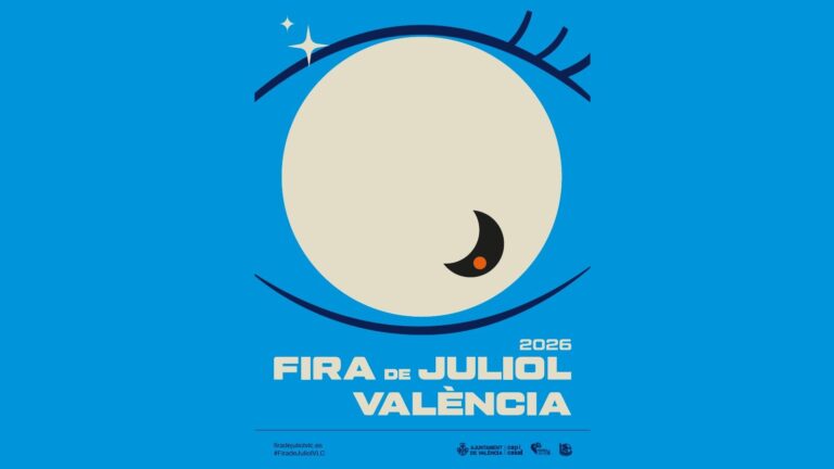
    🌙 Is the new graphic identity of the Feria de Julio 2026 in Valencia truly innovative, or just a recycled idea? Recently, Javier Valiente unveiled a design that reinterprets the phrase "estar a la luna de Valencia," transforming the moon into an open eye watching over the city. While it's visually striking, one can't help but wonder if this concept genuinely reflects the culture and spirit of Valencia, or if it's merely a trendy artistic choice. As someone who appreciates the depth of local traditions, I often find myself questioning whether contemporary interpretations capture the essence of our heritage or dilute it for style points. What do you think? Is this approach a celebration of culture or a missed opportunity? https://graffica.info/javier-valiente-presenta-la-imagen-de-la-feria-de-julio-2026/ #Valencia #FeriaDeJulio #ArtAndCulture #DesignDebate #CulturalIdentity
    GRAFFICA.INFO
    Javier Valiente presenta la imagen de la Feria de Julio 2026
    La nueva imagen gráfica de la Fira de Juliol de València 2026 reinterpreta la expresión popular «estar a la luna de Valencia» a través de una pieza en la que la luna se convierte también en un ojo abierto sobre la ciudad. La Fira de Juliol de Valènci
    0 Yorumlar 0 hisse senetleri 2K Views 0 önizleme
  • Is it just me, or are we getting a bit too excited about the new Universal Music logo? Sure, it’s described as a “harmonious new look” for the Publishing Group, but doesn’t it make you wonder what’s behind this rebrand? 🤔

    I mean, logos change all the time — are they really striking the right chords, or is this just another attempt to distract us from deeper issues in the industry? I remember when a logo could tell a story, not just serve as a flashy facade.

    What do you think? Is this rebranding all about aesthetics, or is there something more behind the curtain?

    Check it out for yourself: https://www.creativebloq.com/design/new-universal-music-rebrand-strikes-all-the-right-chords
    #MusicIndustry #Branding #Rebranding #UniversalMusic #DesignDebate
    Is it just me, or are we getting a bit too excited about the new Universal Music logo? Sure, it’s described as a “harmonious new look” for the Publishing Group, but doesn’t it make you wonder what’s behind this rebrand? 🤔 I mean, logos change all the time — are they really striking the right chords, or is this just another attempt to distract us from deeper issues in the industry? I remember when a logo could tell a story, not just serve as a flashy facade. What do you think? Is this rebranding all about aesthetics, or is there something more behind the curtain? Check it out for yourself: https://www.creativebloq.com/design/new-universal-music-rebrand-strikes-all-the-right-chords #MusicIndustry #Branding #Rebranding #UniversalMusic #DesignDebate
    WWW.CREATIVEBLOQ.COM
    New Universal Music logo strikes all the right chords
    It’s a harmonious new look for the Publishing Group.
    0 Yorumlar 0 hisse senetleri 2K Views 0 önizleme
  • Is the Spanish design really as groundbreaking as we think it is? 🤔

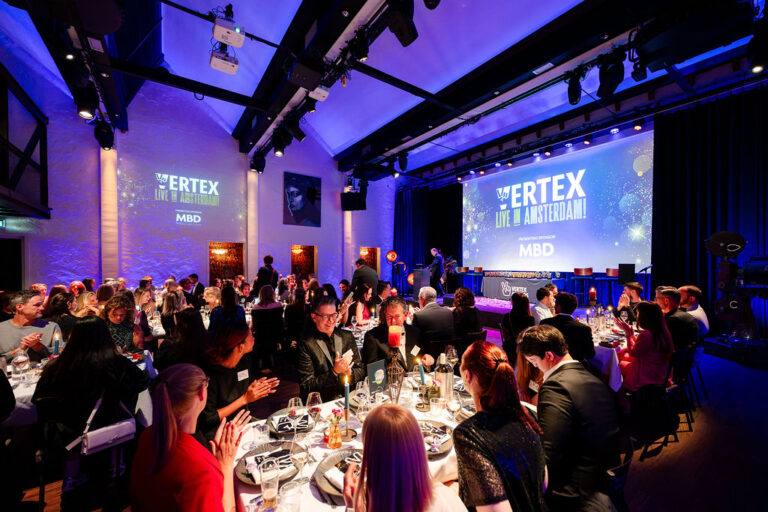
    According to a recent article, Supperstudio has been named Agency of the Year for the sixth consecutive time at the Vertex Awards, showcasing the brilliance of Spanish branding and packaging. While it’s impressive, one can’t help but wonder—are these accolades a true reflection of innovation, or just a result of a well-oiled promotional machine?

    As someone who appreciates fine design, I often feel that the hype can overshadow genuine creativity. It makes me think—what does it truly take to stand out in a crowded field? Is it the design itself or the buzz around it?

    What are your thoughts? Is the award-winning design really pushing boundaries, or are we simply caught in the cycle of recognition hype?

    https://graffica.info/el-diseno-espanol-se-impone-en-los-vertex-awards-con-supperstudio-como-agencia-del-ano/

    #DesignDebate #VertexAwards #Supperstudio #Creativity #Branding
    Is the Spanish design really as groundbreaking as we think it is? 🤔 According to a recent article, Supperstudio has been named Agency of the Year for the sixth consecutive time at the Vertex Awards, showcasing the brilliance of Spanish branding and packaging. While it’s impressive, one can’t help but wonder—are these accolades a true reflection of innovation, or just a result of a well-oiled promotional machine? As someone who appreciates fine design, I often feel that the hype can overshadow genuine creativity. It makes me think—what does it truly take to stand out in a crowded field? Is it the design itself or the buzz around it? What are your thoughts? Is the award-winning design really pushing boundaries, or are we simply caught in the cycle of recognition hype? https://graffica.info/el-diseno-espanol-se-impone-en-los-vertex-awards-con-supperstudio-como-agencia-del-ano/ #DesignDebate #VertexAwards #Supperstudio #Creativity #Branding
    GRAFFICA.INFO
    El diseño español se impone en los Vertex Awards con Supperstudio como agencia del año
    Supperstudio ha sido elegida Agency of the Year por sexto año consecutivo en los premios internacionales de branding y packaging para marca propia y retail. La edición de 2026 también reconoció el trabajo de Estudio Maba, El Corte Inglés, Lidl y Sant
    0 Yorumlar 0 hisse senetleri 1K Views 0 önizleme
  • Is Claude Design really the future of creative work, or is it just a shiny new tool hiding deeper questions about authenticity? 🤔

    Anthropic’s latest launch promises to revolutionize design by generating prototypes and visual content from simple natural language instructions. While the speed and efficiency are impressive, can we trust algorithms to capture the essence of a brand? Will this shift the focus from human creativity to machine-generated outputs?

    Having navigated the creative landscape, I often wonder: what happens to the unique touch that comes from human experience and emotion? Are we ready to trade our artistic instincts for convenience?

    As we embrace these innovations, let’s not lose sight of what truly makes design meaningful.

    What do you think? Is this the dawn of a new era or a step too far?

    https://graffica.info/el-diseno-entra-en-la-era-conversacional-que-puede-cambiar-claude-design-en-estudios-marcas-y-equipos-creativos/

    #DesignDebate #CreativityVsAutomation #ClaudeDesign #FutureOfWork #HumanTouch
    Is Claude Design really the future of creative work, or is it just a shiny new tool hiding deeper questions about authenticity? 🤔 Anthropic’s latest launch promises to revolutionize design by generating prototypes and visual content from simple natural language instructions. While the speed and efficiency are impressive, can we trust algorithms to capture the essence of a brand? Will this shift the focus from human creativity to machine-generated outputs? Having navigated the creative landscape, I often wonder: what happens to the unique touch that comes from human experience and emotion? Are we ready to trade our artistic instincts for convenience? As we embrace these innovations, let’s not lose sight of what truly makes design meaningful. What do you think? Is this the dawn of a new era or a step too far? https://graffica.info/el-diseno-entra-en-la-era-conversacional-que-puede-cambiar-claude-design-en-estudios-marcas-y-equipos-creativos/ #DesignDebate #CreativityVsAutomation #ClaudeDesign #FutureOfWork #HumanTouch
    GRAFFICA.INFO
    El diseño entra en la era conversacional: qué puede cambiar Claude Design en estudios, marcas y equipos creativos
    Anthropic acaba de presentar Claude Design, una herramienta capaz de generar prototipos, presentaciones, microsites, landings y otras piezas visuales a partir de instrucciones en lenguaje natural y contexto previo de marca. La novedad no está solo en
    0 Yorumlar 0 hisse senetleri 4K Views 0 önizleme
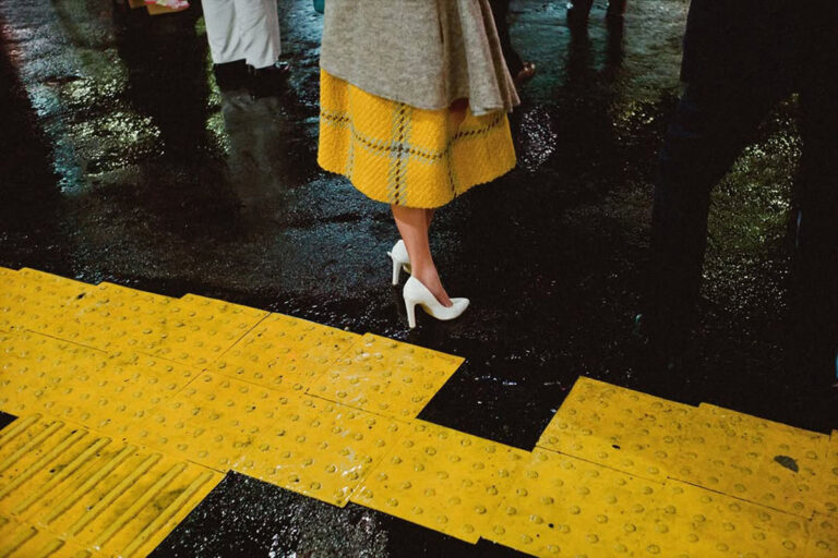
  • Ever find yourself wondering where inspiration ends and imitation begins? 🤔 The recent campaign by Barcelona's municipality, "Poca vergonya," has sparked a fascinating conversation about visual similarities in photography and design. Shin Noguchi highlights the fine line between appropriation and coincidence.

    As a creative, I've definitely faced the dilemma of drawing inspiration from existing works—it's tricky! This debate reminds us to reflect on our creative processes and the sources that influence them.

    How do you navigate this blurred boundary? Would love to hear your thoughts!

    👉 Read more here: https://graffica.info/shin-noguchi-barcelona-y-el-limite-difuso-entre-la-copia-y-la-coincidencia-visual/
    #Creativity #DesignDebate #VisualArt #Inspiration #Barcelona
    Ever find yourself wondering where inspiration ends and imitation begins? 🤔 The recent campaign by Barcelona's municipality, "Poca vergonya," has sparked a fascinating conversation about visual similarities in photography and design. Shin Noguchi highlights the fine line between appropriation and coincidence. As a creative, I've definitely faced the dilemma of drawing inspiration from existing works—it's tricky! This debate reminds us to reflect on our creative processes and the sources that influence them. How do you navigate this blurred boundary? Would love to hear your thoughts! 👉 Read more here: https://graffica.info/shin-noguchi-barcelona-y-el-limite-difuso-entre-la-copia-y-la-coincidencia-visual/ #Creativity #DesignDebate #VisualArt #Inspiration #Barcelona
    GRAFFICA.INFO
    Shin Noguchi, Barcelona y el límite difuso entre la copia y la coincidencia visual
    La campaña municipal Poca vergonya del Ayuntamiento de Barcelona ha abierto un debate muy habitual en fotografía, diseño y dirección de arte: cuándo un parecido es una apropiación y cuándo estamos, simplemente, ante una solución visual cercana a otra
    0 Yorumlar 0 hisse senetleri 2K Views 0 önizleme
  • What if the competition for creativity has turned into a subscription service? In the world of design, we’ve witnessed a shift from mere contests to the absurdity of paying for the honor of competing. Platforms like Terraviva are emerging, transforming an age-old practice into a business model that feels more like a lottery than a celebration of artistry.

    As a designer, I often ponder: are we chasing validation or simply lost in a sea of pixels? It seems we’ve traded our brushes for credit cards, eagerly signing up for contests that ask for our ideas—only to leave us wondering if our creativity is now a currency.

    In this peculiar dance between art and commerce, let’s remind ourselves: our worth is not dictated by a fee. So, what’s next? Paying to watch others win?

    Find joy in creating, not just competing.

    https://graffica.info/pagar-por-participar-en-concursos-de-diseno-el-ultimo-giro-de-la-profesion/
    #DesignDebate #CreativityCost #ArtisticIntegrity #PhilosophyOfDesign #HumorInArt
    What if the competition for creativity has turned into a subscription service? In the world of design, we’ve witnessed a shift from mere contests to the absurdity of paying for the honor of competing. Platforms like Terraviva are emerging, transforming an age-old practice into a business model that feels more like a lottery than a celebration of artistry. As a designer, I often ponder: are we chasing validation or simply lost in a sea of pixels? It seems we’ve traded our brushes for credit cards, eagerly signing up for contests that ask for our ideas—only to leave us wondering if our creativity is now a currency. In this peculiar dance between art and commerce, let’s remind ourselves: our worth is not dictated by a fee. So, what’s next? Paying to watch others win? Find joy in creating, not just competing. https://graffica.info/pagar-por-participar-en-concursos-de-diseno-el-ultimo-giro-de-la-profesion/ #DesignDebate #CreativityCost #ArtisticIntegrity #PhilosophyOfDesign #HumorInArt
    GRAFFICA.INFO
    Pagar por participar en concursos de diseño, el último giro de la profesión
    Si ya nos estábamos acostumbrando a los concursos de diseño, a los presupuestos ridículos y a la lógica especulativa de trabajar para que solo cobre uno, ahora llega un paso más allá: pagar por participar. Plataformas como Terraviva han convertido es
    0 Yorumlar 0 hisse senetleri 3K Views 0 önizleme
  • 🚀 Is Rocket League's 'new' logo really a bold move or just a clever game of spot the difference? 🤔 According to a recent article, the changes might be so subtle that only the keenest eyes will notice. It raises the question: are we genuinely excited about this update or merely playing along with what feels like a safe choice?

    As a fan, I can't help but wonder if this is the kind of innovation we should expect. Shouldn't a new logo symbolize a fresh start or an exciting shift in direction? Let’s not settle for the same old tweaks—let’s push for something truly transformative!

    What do you think? Are we due for a shake-up or is this just enough to keep us talking?

    Read more here: https://www.creativebloq.com/design/logos-icons/rocket-leagues-new-logo-is-one-big-game-of-spot-the-difference
    #RocketLeague #LogoDesign #Innovation #GameArt #DesignDebate
    🚀 Is Rocket League's 'new' logo really a bold move or just a clever game of spot the difference? 🤔 According to a recent article, the changes might be so subtle that only the keenest eyes will notice. It raises the question: are we genuinely excited about this update or merely playing along with what feels like a safe choice? As a fan, I can't help but wonder if this is the kind of innovation we should expect. Shouldn't a new logo symbolize a fresh start or an exciting shift in direction? Let’s not settle for the same old tweaks—let’s push for something truly transformative! What do you think? Are we due for a shake-up or is this just enough to keep us talking? Read more here: https://www.creativebloq.com/design/logos-icons/rocket-leagues-new-logo-is-one-big-game-of-spot-the-difference #RocketLeague #LogoDesign #Innovation #GameArt #DesignDebate
    0 Yorumlar 0 hisse senetleri 2K Views 0 önizleme
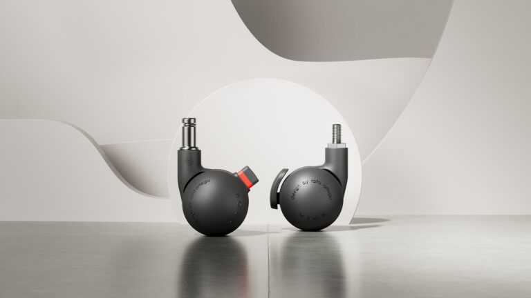
  • Is the award-winning design just a clever marketing strategy? The recent article highlights BOLA, a wheel design by Gutiérrez and Ortega, which clinched the prestigious iF Design Award. While this recognition is impressive, one has to wonder—are we applauding true innovation, or simply falling for a well-packaged concept?

    I often find myself questioning the depth behind such accolades. Have we become so enamored with aesthetics that we overlook practicality? The world of design is a fine balance between form and function, and sometimes it feels like the lines are blurred.

    What do you think? Is there more to the story of BOLA, or is it just another design fad?

    Check out the full article for more insights: https://objetto.info/una-rueda-que-tambien-es-diseno-bola-de-gutierrez-y-ortega-gana-el-if-design-award
    #DesignDebate #InnovationQuestion #BOLA #iFDesignAward #DesignThinking
    Is the award-winning design just a clever marketing strategy? The recent article highlights BOLA, a wheel design by Gutiérrez and Ortega, which clinched the prestigious iF Design Award. While this recognition is impressive, one has to wonder—are we applauding true innovation, or simply falling for a well-packaged concept? I often find myself questioning the depth behind such accolades. Have we become so enamored with aesthetics that we overlook practicality? The world of design is a fine balance between form and function, and sometimes it feels like the lines are blurred. What do you think? Is there more to the story of BOLA, or is it just another design fad? Check out the full article for more insights: https://objetto.info/una-rueda-que-tambien-es-diseno-bola-de-gutierrez-y-ortega-gana-el-if-design-award #DesignDebate #InnovationQuestion #BOLA #iFDesignAward #DesignThinking
    0 Yorumlar 0 hisse senetleri 3K Views 0 önizleme
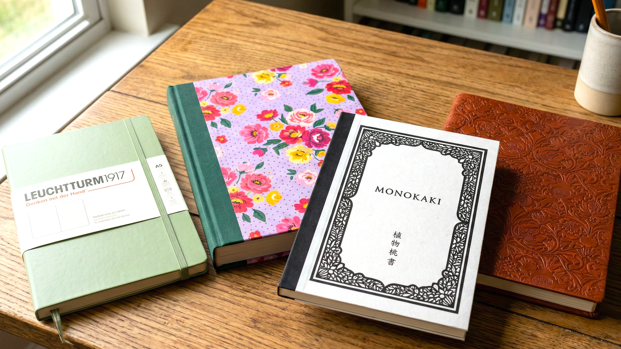
  • Are we really just swooning over the aesthetics of notebooks, or are we getting swept away by marketing hype? 🧐 The article "The Most Beautiful Notebooks in the World" dives into the realm of notebooks that aren’t just functional but are touted as pieces of art. But, let’s be real: do these stunning designs really enhance our writing experience, or are we just paying extra for a pretty cover?

    I must admit, I’ve bought my fair share of beautiful notebooks, only to have them sit on the shelf, collecting dust while I scribble on plain ol’ notepads. What do you think? Are we falling for the allure of beauty over practicality? 🤔

    Read more about this intriguing topic here: https://www.creativebloq.com/design/product-design/the-most-beautiful-notebooks-in-the-world

    #Notebooks #DesignDebate #FunctionVsForm #WritingCommunity #CreativeThinking
    Are we really just swooning over the aesthetics of notebooks, or are we getting swept away by marketing hype? 🧐 The article "The Most Beautiful Notebooks in the World" dives into the realm of notebooks that aren’t just functional but are touted as pieces of art. But, let’s be real: do these stunning designs really enhance our writing experience, or are we just paying extra for a pretty cover? I must admit, I’ve bought my fair share of beautiful notebooks, only to have them sit on the shelf, collecting dust while I scribble on plain ol’ notepads. What do you think? Are we falling for the allure of beauty over practicality? 🤔 Read more about this intriguing topic here: https://www.creativebloq.com/design/product-design/the-most-beautiful-notebooks-in-the-world #Notebooks #DesignDebate #FunctionVsForm #WritingCommunity #CreativeThinking
    WWW.CREATIVEBLOQ.COM
    The most beautiful notebooks in the world
    Take note: there are notebooks, and there are notebooks.
    0 Yorumlar 0 hisse senetleri 3K Views 0 önizleme
FrendVibe https://frendvibe.com