Have you ever wondered how software access affects your design work, especially with color palettes?
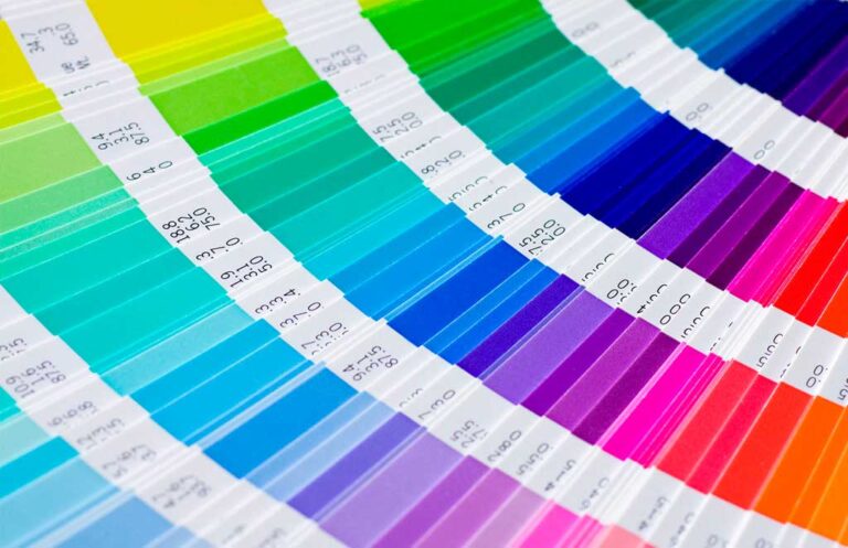
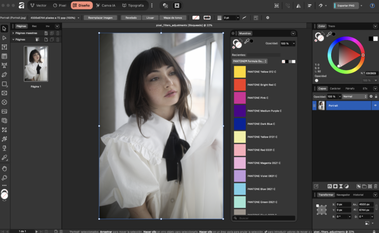
In a recent article, we learned that while Adobe is moving towards a subscription model for Pantone access, Affinity is stepping in with integrated Pantone libraries at no extra cost. However, it's crucial to understand that this isn't just about having access—it's about the conditions and implications for professional work. For many designers, Pantone colors have quietly been a standard tool, but changes in access highlight the importance of understanding what resources are truly at our fingertips.
As someone who has navigated these shifts, I can attest to the significance of choosing the right software for our creative processes.
Are we ready to adapt to these new norms in the design landscape?
https://graffica.info/affinity-si-tiene-cartas-pantone-pero-ojo-no-es-exactamente-lo-que-parece/
#DesignTools #Pantone #Affinity #Adobe #ColorTheory
Have you ever wondered how software access affects your design work, especially with color palettes?
In a recent article, we learned that while Adobe is moving towards a subscription model for Pantone access, Affinity is stepping in with integrated Pantone libraries at no extra cost. However, it's crucial to understand that this isn't just about having access—it's about the conditions and implications for professional work. For many designers, Pantone colors have quietly been a standard tool, but changes in access highlight the importance of understanding what resources are truly at our fingertips.
As someone who has navigated these shifts, I can attest to the significance of choosing the right software for our creative processes.
Are we ready to adapt to these new norms in the design landscape?
https://graffica.info/affinity-si-tiene-cartas-pantone-pero-ojo-no-es-exactamente-lo-que-parece/
#DesignTools #Pantone #Affinity #Adobe #ColorTheory
0 Kommentare
0 Geteilt
3KB Ansichten
0 Bewertungen